MADELYN STAFFORD
Graphic Design Portfolio
NYU Steinhart - Digital Art & Design
Project Goals and restrictions
Choose a book that I think could use an update and redesign. I have to use the book’s title and author, retain the size and proportions of the original book cover,
Process
I chose my favorite book “Shatter Me” by There Mafi. I do really like the original book cover, but I felt like it had nothing to do with the title, so I redesigned the book cover in 2 different styles. After doing so I chose the cover I thought was the strongest and refined it, while still keeping some elements from the original book cover.
NYU Steinhart - Digital Art & Design
Project Goals and restrictions
I created 2 magazine covers featuring my name in type to represent one realistic profession through type choice and composition.
Process
I first decided on a profession to portray on the magazine. once I landed on a musician/rapper I referenced multiple rap names as well as magazine covers featuring various rappers, as well as magazines solely portraying album covers. I then found an image of myself to portray myself as the rapper. I then went to Spotify to accurately recreate a play back bar and placed each element together in illustrator.
Direct Response Consulting Services - Graphic Designer
Project Goals and restrictions
I was asked to make a coloring book to effectively educate children about fire safety .
Process
I gathered images and source material to create an educational, yet fun coloring book that spans 12 pages.
NYU Steinhart - Digital Art & Design
Project Goals and restrictions
Design a pair of posters for an event inspired by a typeface. These posters should work individually but also as a pair, connecting both visually and conceptually. On each poster I needed to include the exhibit information.
Process
For this process I imagined an art exhibit hosting artists that used coding, computers, and lights to make their art standout. I thought of a poster that would combine the new age of technology with a classical form of art such as painting to convey the relation of these two in the exhibit.
Direct Response Consulting Services - Graphic Designer
Project Goals and restrictions
I was asked to make a Brochure to effectively educate women about breast cancer .
Process
I gathered images and source material to create an educational and informative, brochure.
Aperio Global - Jr. Graphic Designer
Project Goals and restrictions
I was tasked to design a futuristic and stable logo for Aperio Global
Process
I made 6 different logo designs by looking at their website and speaking with the CEO to finalize the color palette of the logo, as well as drew inspiration from the futuristic aspects in Wall-E. After doing so I shared the rough designs with Aperio Global, and refined the one of choice.
Direct Response Consulting Services - Graphic Designer
Project Goals and restrictions
I was asked to make a letter reply to effectively gather donations for the National Breast Cancer Research Center from concerned community members. .
Process
I edited the letter for any mistakes and formatted the letter so the corner card shows through the window and the key line space is clean.
Direct Response Consulting Services - Graphic Designer
Project Goals and restrictions
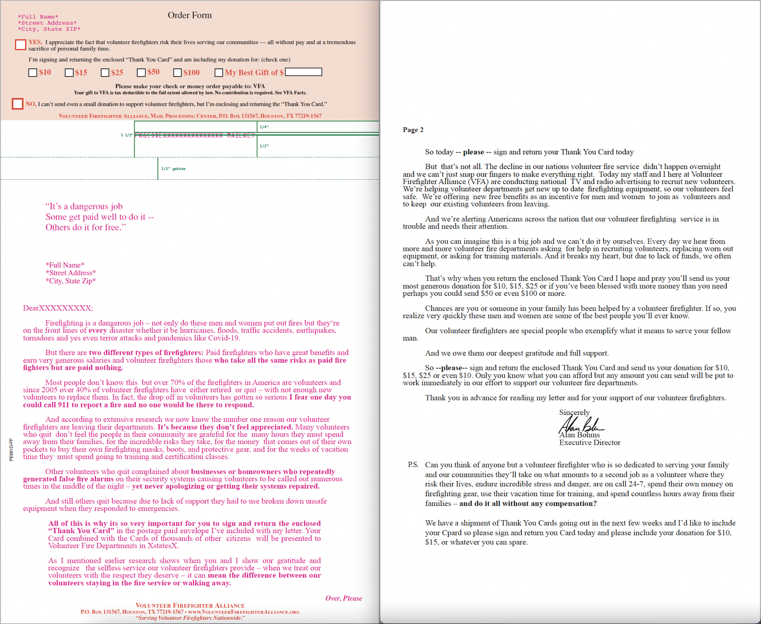
I was asked to make a letter reply to effectively gather donations for the National Police Association from concerned community members. .
Process
I edited the letter for any mistakes and formatted the letter so the corner card shows through the window and the key line space is clean.
NYU Steinhart - Digital Art & Design
Project Goals and restrictions
Using the rapper profession I made up for my magazine cover, I was tasked to create 2 entirely different logos, using 2 different typefaces.
Process
In the first logo (on the left side) I wanted to make a traditional logo, that matches the industry standard. In the second logo (on the right side) my goal was to use negative space to create another version of the logo.
NYU Steinhart - Digital Art & Design
Project Goals and restrictions
The goals were to refine my strongest logo from the logos above and also show my logo at a small scale to ensure that it will read at a reduced size
Process
For this task I corrected the kerning between the “W” and the “A” in SWAYNE.
NYU Steinhart - Digital Art & Design
Project Goals and restrictions
Create a 2 x 3.5 inch horizontal business card.
Process
After deciding the color palette of my company and then used lines and and asymmetrical cuts to create a visually stimulating and interesting business card.
NYU Steinhart - Digital Art & Design
Project Goals and restrictions
I had to design merchandise, i.e. a shirt and tote back that goes along with my poster/exhibit idea.
Process
I took the same elements that were in my poster idea; the fading of 1’s and 0’s, and added it to the shirt and tote bag. I used the same red from the painting on the posters as the background for the tote bag and shirt for continuity.
NYU Steinhart - Digital Art & Design
Project Goals and restrictions
Out of the 5 classifications of typefaces, I was asked to choose 3 that I liked. I then recreated those typefaces in a phrase of my choosing by free-hand drawing each letter.
Process
For his process I chose the 3 typeface classifications that would give me a challenge, but also clearly articulate my message. I then found images of the alphabet in each typeface and referenced that while I used the curvature and pen tool to accurately recreate each letter, while still keeping an eye on the kerning of each word.
NYU Steinhart - Digital Art & Design
Project Goals and restrictions
For this project I was tasked to create a typographic composition using illustrator and the supplied text from, “Thirty-three visual communicators renew the 1964 call for a change of priorities Manifesto”. In this project I considered hierarchy, sensical and logical order, readability and approachability. I was cognizant of the positive and negative forms created by the compositions I created as well as how “white space” and typographical texture can support the intentions of a typographic composition.
Process
The main concern of this project was making sure the manifesto was readable, but I also wanted to incorporate the manifesto and negative and positive space in a creative way. To do this I wrapped the manifesto text around the portrait to ensure readability. In addition to this I built my face on illustrator using the verbiage provided. To achieve the various tones in this piece I range the type color from white to black and placed each word accordingly.
Madelyn Stafford Art - Graphic Art
Adobe Photoshop
Madelyn Stafford Art - Graphic Art
Adobe Illustrator
Madelyn Stafford Art - Graphic Art
Adobe Photoshop
Madelyn Stafford Art - Graphic Art
Adobe Photoshop